Brand Identity
Azure Authentic Gold Jewlery
I developed this brand from the ground up, beginning with concept development and progressing through logo design, typography selection, and color strategy. The final identity extended into curated photography and visual assets, resulting in a cohesive brand the client was highly satisfied with.
Check it out!
Here's How I Did It
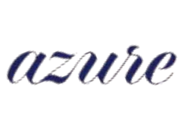
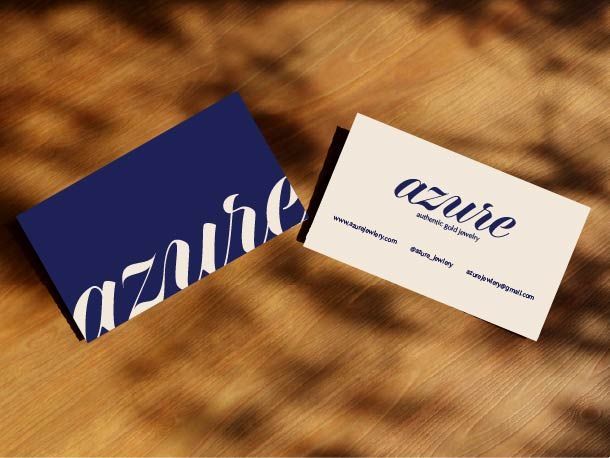
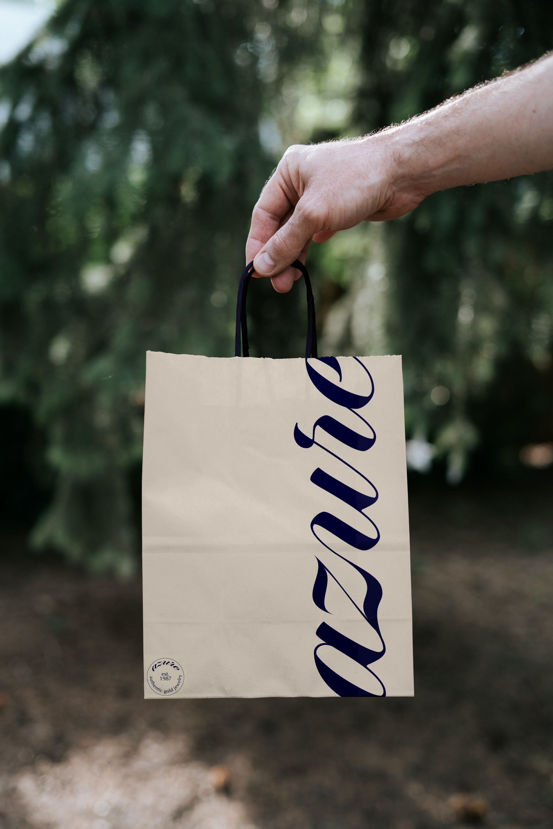
Logo
I began by sketching multiple logo concepts and discovered that a flowing cursive mark naturally resembled ocean waves. This direction aligned with the name “Azure,” meaning sky blue, and reinforced the client’s focus on nature and authentic gold.
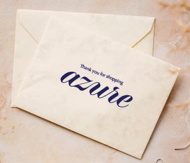
Font & Colors
To align with industry standards seen in luxury brands such as Tiffany & Co. and Cartier, I selected a primary signature color. A soft sand accent complements the ocean-inspired logo, while a clean, refined typeface was chosen to contrast the cursive mark and maintain readability with a simple, luxury feel.

Photos
I directed and executed a studio photoshoot to create cohesive branded imagery. Using colored gels, I produced a blue backdrop with warm gold highlights on the jewelry. The final images were used across social platforms and increased engagement.